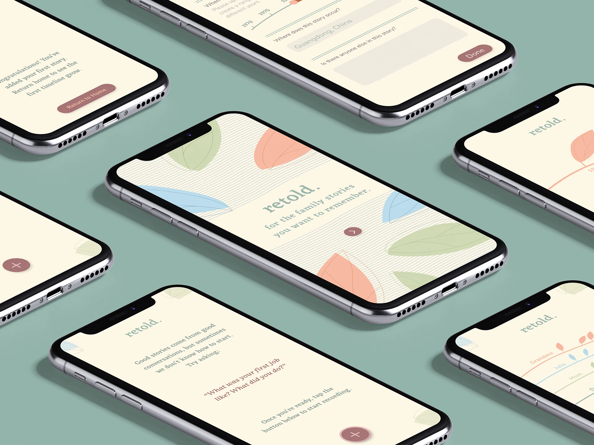
Retold is an app prototype for family stories
A personal project that came from all of the family stories I wish I had written down
As I’ve grown older, family stories of the past — on childhood, adolescence, early adulthood, the younger self—drift in and out of my memory as they are mentioned only in passing, as snippets of conversations, and never written down. Only recently I have felt a need to record these stories somehow, so I can keep them close and save them for later.
Retold is a project inspired by this sentiment: I hoped to develop an app concept that could encourage these conversations to happen and keep record of these stories in one place.
With this clickable prototype and case study below, I hope to show my solution to the challenge of creating an app that is both sympathetic and sensitive in its language, branding and motion; I hope to capture within it a sense of openness that is as loosely defined as when we think of memories, storytelling, and the past.
Goals
Retold should ideally allow for a user to perform two main functions:
To record an audio or video story as it is being told by a family member
To see these recorded stories within an individual storyteller’s timeline in order to track, store and organize the stories according to time, location, individuals, etc.
A video walkthrough of the prototype can be found at the end of this article.
A Brief Look at ‘Competitors’
I began my research process by looking at what was already on the market in terms of family history apps.
Courtesy of ancestry.ca (left) and familysearch.org (right)
Perhaps most recognizable is ancestry.ca, but its focus on genealogy, DNA, ethnicity and tracing generations of lineage is different from what I hope to achieve with my concept. Still, I took a brief look at the branding of their website, and noted that the visual language overall was quite minimal, as the focus of the main page is on testimonials of the program. While ancestry.ca promises in-depth information to a user, my concept relies heavily on a user to be the creator of the content.
In contrast to this, familysearch.org is interested in the same subject I am — users input “family memories” into the program and the memories are added into a virtual family tree. However, the overall look and feel of the program is secondary to the information—the white space and lack of instruction leaves a user to find out what to do themselves.
I wanted to emphasize what I felt was lacking in these two examples: a sense of home, family, connection and warmth. Because of this, I was motivated to come up with a different way to represent timelines and stories.
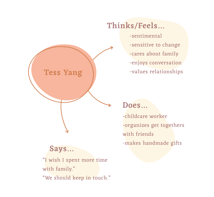
Empathy Map: Snapshot of a user
Yes, Tess Yang does sound very similar to my name. Yes, in this case I am my own user. Hmm…
Concept Development: Initial Sketches
When I began the sketching process, I intended to keep the main goals of the app — the record button and timeline function — together, ideally on the home screen, for a user’s ease of access to both.
The biggest part of my initial brainstorming was focussed on re-imagining a timeline design. I considered what a timeline could look like if it was stretched out on its side or interacting simultaneously with other timelines.
I began with an idea where individual wavelengths could represent a different person. I imagined how a user could tap on one of the wavelengths on the home screen to then access this particular individual’s timeline, where recorded stories would be organized by year.
As I continued to sketch, I thought of ways I could use small motion transitions to emphasize how this timeline idea relies on connection and plays with an idea of scaling or zooming.
Defining the Brand: Moodboard
For the look and feel of Retold, I focussed on the keywords of warmth, connection, intimacy and history to guide my visual research. Because of this, I felt a soft illustrative style with earthy tones could work effectively.
Development of Assets and Illustration Style
The wavelength idea in my sketches proved to be too dramatic as it led to confusion over if it was instead a graph. I decided to tone down the waviness of the lines until they more closely resembled threads, and built the imagery of leaves to tie in the idea of growth and development.
The serif typeface Eczar, was chosen for its calligraphic quality, tying in the ideas of storytelling, history and tradition.
I decided to keep the type treatment and illustrations quite simple, because I wanted the focus to be on the motion and transitions which would be later added in through Adobe XD.
The Solution: Video Walkthrough
The final solution brings together the above assets through the addition of small animated transitions in order to walk a user through the use of the app for the first time. At the end of the video, there is an example of what the app might look like after a few months of use.
Some of the features would be:
a. ‘rolling’ questions that a user may use to begin conversations with
b. the opportunity to add a year range for stories that are remembered to have occurred for a rough period of time
c. the ability to view all timelines from afar and up close
In conclusion
Thank you for checking out this project. I include this in my portfolio because it is a special one for me- I think this project, and the ideas I’ve tried to communicate with it, really speak to the person I am (uh… sentimental), and how important it is, in my opinion, to ask for and save the stories of family history so that we can remember our loved ones and the lives they led after they are gone.
I would like to dedicate this project to my grandparents, 徐永光, 许李娇 and 秀娇 who I miss very much. My memories of them, and the conversations I still wish we could have had, motivated me throughout this creative process.


