James and the Giant Peach Book Design
James and the Giant Peach
Redesigning the classic children’s novel
For this project, I created a new front cover, back cover and interior spreads for one of my favourite books as a kid, Roald Dahl’s James and the Giant Peach. Knowing that the target audience of this book is elementary aged children, the objectives of the project was to:
create visual interest in the whimsical story inside with a new illustration style but also
ensure that the new redesign would serve the practical function of being a pleasant experience to read.
A new illustration style for a familiar cast of characters
James and the Giant Peach features a cast of opinionated insects, unfathomably evil aunts, and a very sweet young boy who just wants a friend. Characters burst into song, occasionally even break into dance—what’s not to love?! I love this book, because it is a little weird, but the weirdness adds to it. I wanted to create an illustration to match, but also ensure the illustrations wouldn’t get too out of control and compete with the text. The final style emphasizes my hand drawn line work, and dimension is added not by colour but through repeated textures and patterns. Though, not to say there isn’t colour! Orange is used, but minimally, which you can see below.
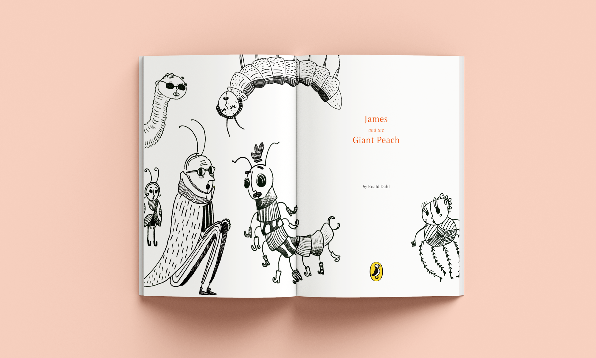
Inside title page featuring the blind Earthworm, sweet Ladybug, sleepy Silkworm, wise Grasshopper, silly stylish Centipede, and the kind Spider.
Combining carefully typeset text with textured illustration
Because of the children’s book format, I decided to pair chapter illustrations with the beginning of each chapter, so that there could be a consistent rhythm of text to imagery, and create anticipation for what was to come. I was heavily inspired by traditional book design when it came to the typography and typesetting because of the classic nature and history of this book: careful attention was given when typesetting the justified blocks of text for an ultimately traditional and refined feeling. Finally, to balance the orange element used throughout every chapter illustration, are the decorative peach illustrations around the chapter numbers.
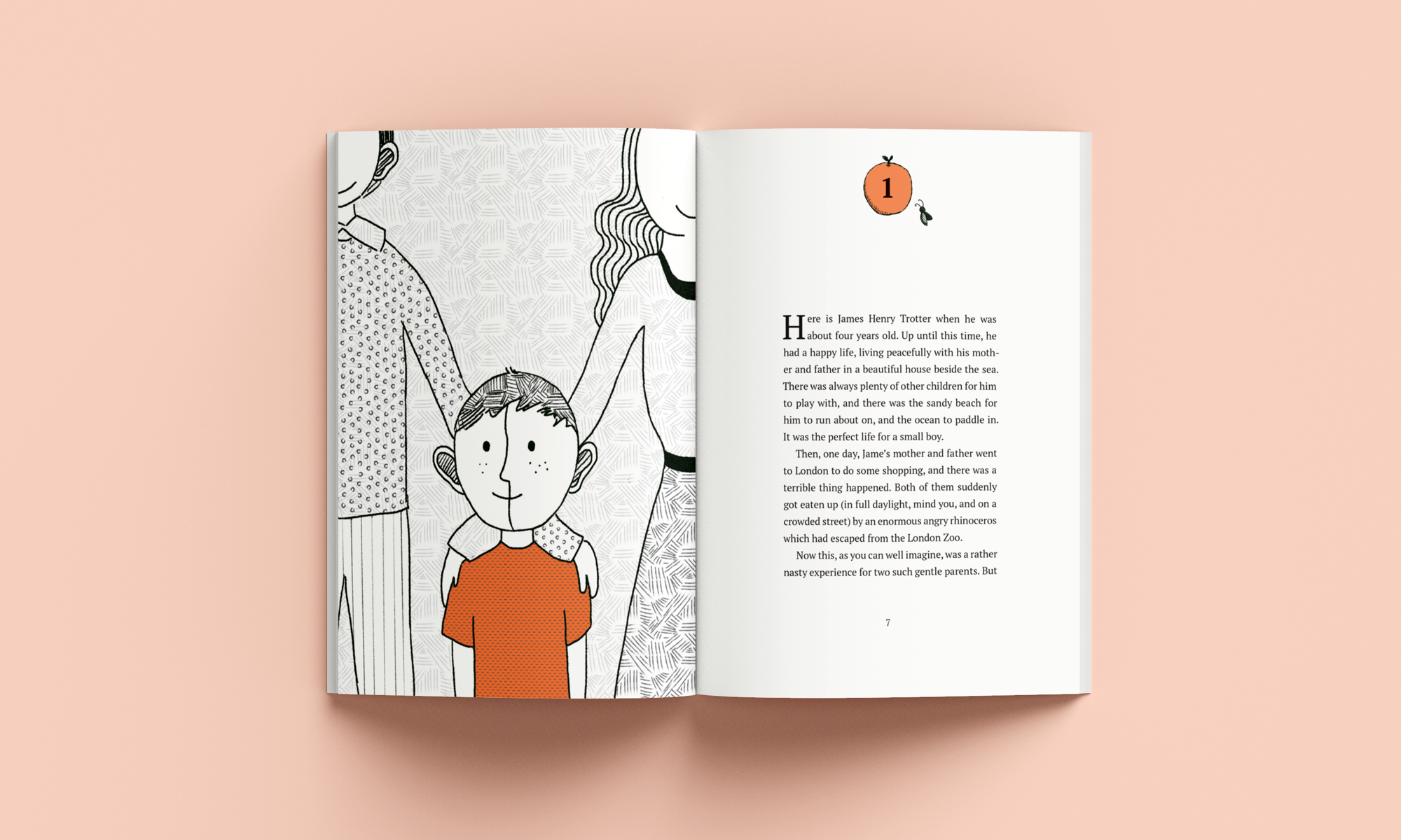
Chapter one spread showing James with his parents before the terrible thing happened

Chapter three spread showing the strange but very friendly crocodile tongue salesman emerging from the bushes
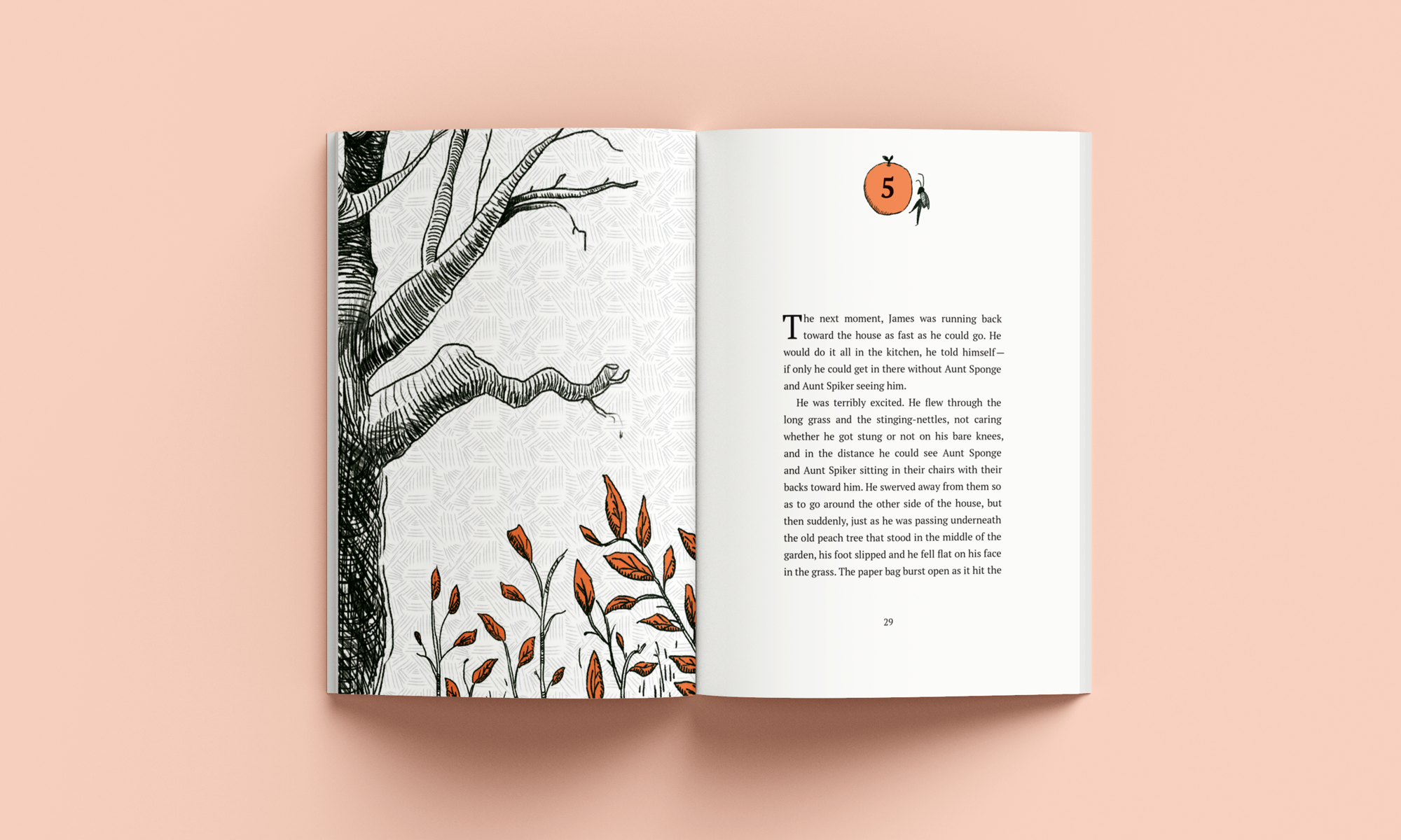
Chapter five spread showing the barren (for now) peach tree in the backyard of the sadistic Aunt Sponge and Aunt Spiker
In conclusion
This is one of my favourite projects because I got the chance to work on and be inspired by one of my favourite stories growing up. This project demonstrates my ability to adapt my illustration style to create a completely new and custom system of illustrations. It also demonstrates my ability to balance content with visuals, and typeset proficiently in Adobe Indesign.
Awarded
Clear Space Award for Story-telling, Honourable Mention, RGD Student Design Awards 2019
Project tags
Book design, typesetting, children’s book illustration

